Site configuration view in Manager UI
Site configuration view is available to VividWorks Admin and Tenant Admin users.
Selecting a site in the vertical left menu, will open a submenu with three options that we will detaliate further: "Settings", "Product catalog" and "Configurator appearance".
Settings
There are 4 tabs for configuration
- General - dealing with publishing, renaming and deleting a site.
- Products - products and libraries can be added/removed to/from a site.
- Allowed Sources - restricting placement of the planner to specific host sites (URLs)
- Unit System - utilizing SI or Imperial system for the measurements
General tab
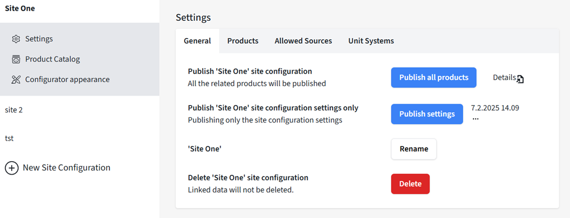
Publish all products - All the products from all the libraries associated to this site configuration will be published. Publish settings - All the site configuration settings will be published. No product will be published. Rename - Rename a site. Delete - Delete a site.
Products tab
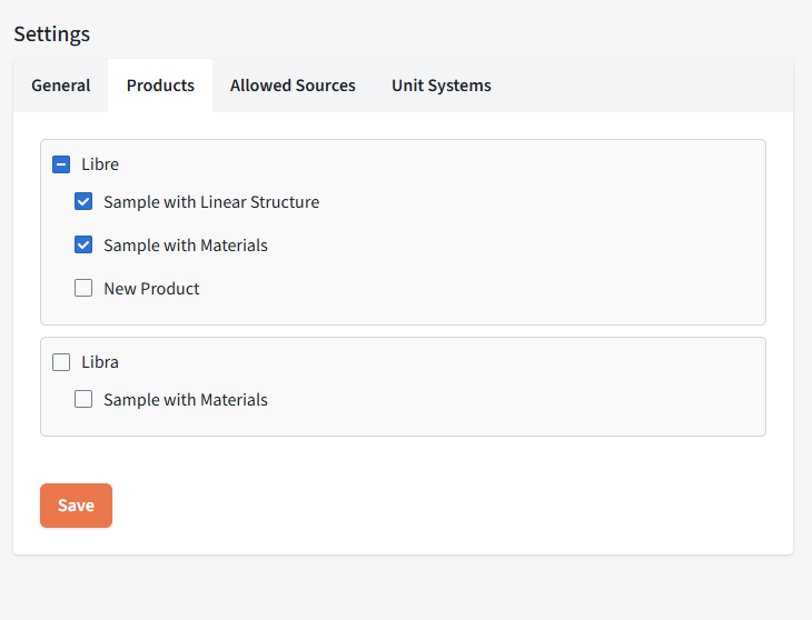
From here you associate products to a site. Selecting a library will select all the products beneath. You need to press Save for the changes to take effect.
Allowed resources tab
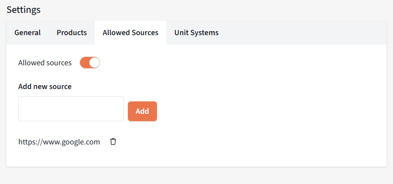
From here you can restrict the access for a planner instance only from certain domains and pages.
Each product library may have a set of domains and pages in form of URLs that can access the product library data.
In order for the restrictions to work, you must have listing of allowed domains defined and "enable allowed sources" selected. If no allowed hosts is listed and/or "Enable allowed sources" is not selected, no restrictions apply.
Select a product library to configure
You can assign urls for each product library that can be selected from the dropdown above.
Add and remove new allowed source
Insert the text in FQDN format in the textbox below and then press "Add".
Site urls can be deleted by pressing the "delete" icon on each row.
Enable or disable allowed sources handling
To turn on restriction to only allowed list, select the checkbox for "Enable allowed sources". To disable restrictions, unselect the checkbox for "Enable allowed sources".
Note
The intention for this feature is to restrict unauthorised access to the configurator data by only permitting named sites to have access.
Unit system tab
From here you can set the measurement units being displayed in the 3D view.
You can select the system unit and length unit.
Possible values for the system unit:
- "metric"
- "imperial"
Possible values for the length unit:
The metric unit system:
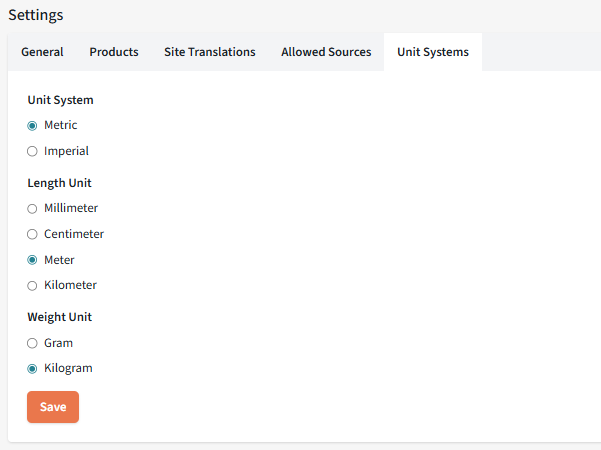
Length Units
- "millimiter"
- "centimeter"
- "meter"
- "kilometer"
Weight Units
- "gram"
- "kilogram"
The imperial unit system:

Length Units
- "inch"
- "foot"
- "yard"
- "mile"
Weight Units
- "ounce"
- "pound"
You can also set a maximum denominator for the fractional display format.
- "2"
- "4"
- "8"
- "16"
- "32"
Note
There is also a Time Unit (which is selectable from the SalesCodeMapping and the LengthEditor in planner). The time unit is always the second, for both metric and imperial unit systems.
Product catalog
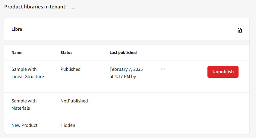
This view contains a list of all libraries and their products. The products have the next columns:
Name : Product name Status: Published - product was published, Not published - added to site but not yet published, Hidden - not yet added to the site. Last published: if published here will appear the date of the last piublish and name of the user who did the publish. Also if the published version contains prebuilt components, they will appear here under a sub list. "..." : a popup menu that currently has only the "Embed code" dialog. Each prebuilt can also be embeded using the "..." dialog. Unpublish: action button for unpublishing a product. Un publishing will remove the product from the site and do a publish without the unpublished product.
Above each set of products there is the parent library. In the right part there is a link that will bring you to the actual tree view of the library.
Configurator appearance
There are 3 tabs for configuration
- Theme - customizing the Planner theme
- Branding - customizing branding in PDF
Theme tab
From here you can configure the colors of some of the CSS elements of the planner.
You can set the CSS attributes for the element of the planner UI
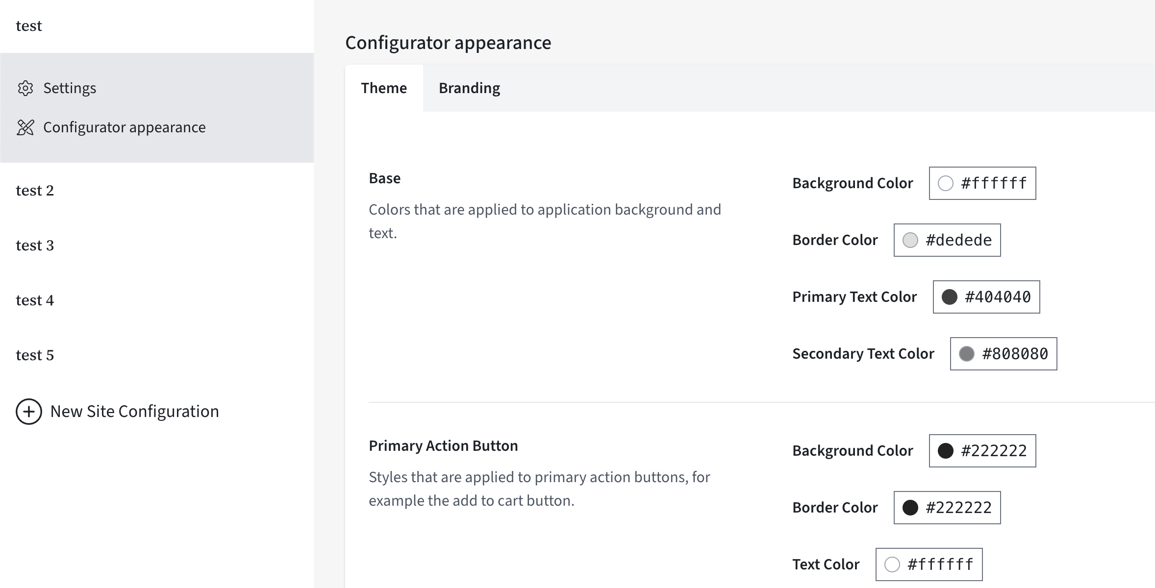
The attributes that can be edited are:
Base - Colors that are applied to application background and text:
- Background color
- Border color
- Primary Text Color
- Secondary Text Color
Primary Action Button - Styles that are applied to primary action buttons, for example the add to cart button:
- Background color
- Border color
- Text color
- Border radius
- Box shadow
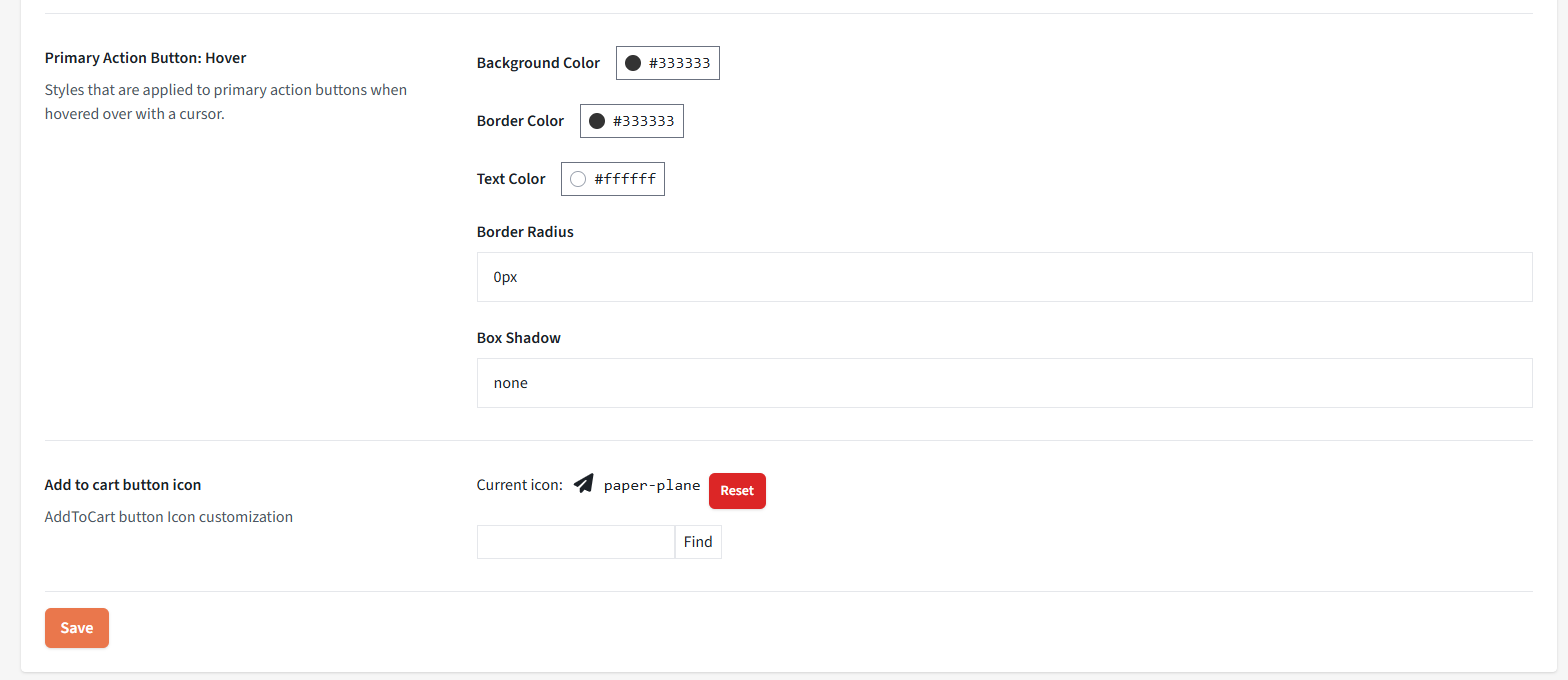
Primary Action Button: Hover - Styles that are applied to primary action buttons when hovered over with a cursor:
- Background color
- Border color
- Text color
- Border radius
- Box shadow
Add to cart button icon - AddToCart button Icon customization:
- Here you can select or delete the icon assigned to the add to cart button. You can search for an icon usign the Find button. The Reset button will remove the selected icon. In this case a default "basket" icon will be assigned.
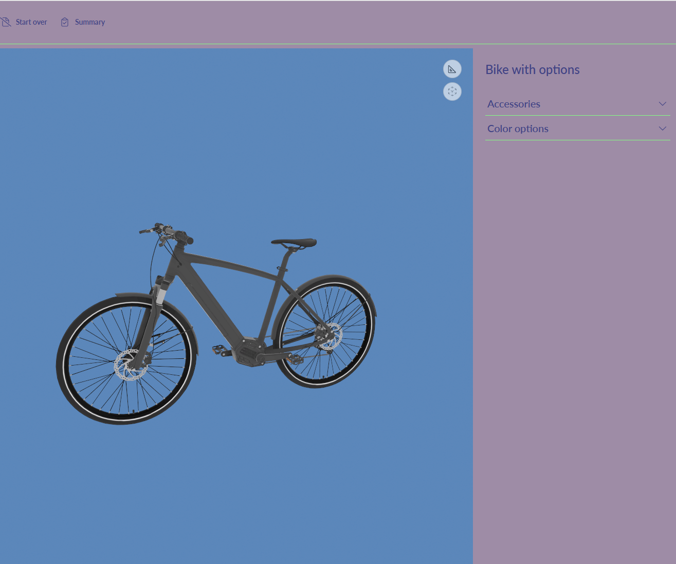
You can see where these take effect in the following image where
- 3D Scene is configured for Blue
- Background color is set to Purple
- Border color is set to Green
- Primary Text Color is set to Dark Blue
- Secondary Text Color (not shown) is set to Black
After saving, return to Products view and regenerate runtime products for the theme to be applied. Note that due to CDN and caching the theme edits may take a while before they are applied in production and testing is easiest using the Manager UI View Product feature
NOTES:
- The settings affect all parts of the application, therefore Border Color adjusts also borders of summary
- Primary Text Color affects most text on the planner and summary
- Secondary Text Color affects specific lines in summary