Grid Structure documentation
Overview
Grid structure is a structure logic that aligns components along fixed grid lines. Grid structure can be used for example to construct shelving products and cabinet interiors.
You add Grid Structure Logic to the product tree by adding the logic to the product in question.
You then either add new parts (see: add items in product tree) or move parts as children under the Grid logic (see: Moving items in product tree)
Base properties
The base properties of Grid Structure determine the shape and size of grid cells and how the grid expands as more components are added to it.
RootProperties
![ITEM_TYPE: GridStructureDefinition]
| Property Name | Type | Localized | Description |
|---|---|---|---|
| ParentToSurface | Connector | N | The connector which defines the position of the place origin point relative to the parent component. The origin point is the corner. Default surface normal is up (0, 1, 0), and can be configured by applying a rotation to this connector. |
| ParentToSurface/Alignment | Vector | N | |
| ParentToSurface/Offset | Vector | N | |
| ParentToSurface/AlignedOffset | Vector | N | |
| ParentToSurface/Rotation | Vector | N | |
| Enabled | Toggle/scripting | N | Toggle this to enable/disable all the elements under the Grid structure. Toggle can be dynamically controlled through scripting |
| DisplayName | Text Field | Y | Name of the structure |
| ItemPlacement | Radio Button | N | When instantiating an element: - PlaceSingle (will show the possible placer one time only, then you need to click the element again.) - PlaceInSequence (will show the placer automatically after every addition, hence making adding new elements faster.) |
| MaxDynamicRows | Integer | N | Maximum number of extra rows for dynamically expanding grid. The value -1 denotes unlimited expansion. The value 0 disables dynamic expansion. |
| MaxDynamicColumns | Integer | N | Maximum number of extra columns for dynamically expanding grid. The value -1 denotes unlimited expansion. The value 0 disables dynamic expansion. |
| FixedRowSizes | Vector | N | The sizes for static rows. The value must be given as a script, for example [1.0, 0.4, 1.0]. The number of elements determine the number of static rows. If disabled or set to null, the grid only uses dynamic rows. |
| FixedColumnSizes | Vector | N | The sizes for static columns. The value must be given as a script, for example [1.0, 0.4, 1.0]. The number of elements determine the number of static columns. If disabled or set to null, the grid only uses dynamic columns. |
| RequireConnectedness | Toggle | N | If enabled, all the components in the grid must connect together. |
| GridGap | Vector | N | The amount of empty space between the grid cells. X is for column-wise distance and Y for row-wise distance. |
Scripting
Structure-level properties
| Property | Type | Description |
|---|---|---|
| Components | Vector | Child components currently placed in the grid structure. |
| ComponentCount | Number | Number of components currently placed in the structure. |
Example: check whether the current grid structure contains a child whose PartType custom property is Door.
Contains(PropertyValues(this.Components, "PartType"), "Door")
Grid connections
Grid components expose helper functions for resolving connected neighbors based on the grid connectivity rules.
| Function | Description |
|---|---|
| GetConnectedComponentLeft(index) | Returns the connected component to the left of the component at the given row index. |
| GetConnectedComponentRight(index) | Returns the connected component to the right of the component at the given row index. |
| GetConnectedComponentTop(index) | Returns the connected component above the component at the given column index. |
| GetConnectedComponentBottom(index) | Returns the connected component below the component at the given column index. |
Notes:
- The functions return
nullif there is no neighboring component or if the edge types are not connected in the GridConnectivity matrix. - For multi-cell components,
indexselects the row or column along the edge (0-based).
Example:
GetConnectedComponentRight(0)?.Name ?? ""
Optional property sets
GridConnectivity
GridConnectivity properties
![PROPERTY_SET: GridConnectivity]
| Property Name | Type | Localized | Description |
|---|---|---|---|
| EdgeConnectivity | chart view | N | A mapping of edge types that can connect or are allowed to be adjacent to each other. See Grid Logic with Multiple Layers for more details. |
| CornerOverlap | chart view | N | The mapping between corner types or layers on grid components that are allowed to overlap. See Grid Logic with Multiple Layers for more details. |
| AreaOverlap | chart view | N | The mapping between area types or layers on grid components that are allowed to overlap. See Grid Logic with Multiple Layers for more details. |
CustomProperties
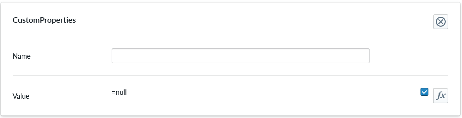
Custom Property set (or sets) allow definition of logic that defines something that otherwise is not predefined in the system logic.
| Property Name | Type | Localized | Description |
|---|---|---|---|
| Name | Text field | N | The name of the custom property. It can be referred to from other scripts |
| Value | Scripting | N | Value or scripting logic that the property has |
ValidationRule
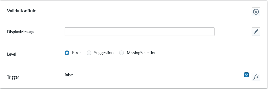
Validation rule property set is used to define logic that can be useful to ensuring the item where the validation rule is will follow define rules.
| Property Name | Type | Localized | Description |
|---|---|---|---|
| DisplayMessage | Text Field | Y | Text that is shown on the Planner when the conditions of the rule are true |
| Level | Radio Button | N | Selection should the rule show error, suggestion or indicating something is missing |
| Trigger | Scripting | N | The logic that defines the validation rule |
Note
Validation rule level states correspond the next error levels. Error => "Error" Missing Selection => "Warning" Suggestion => "Info"
If the "add to cart" button is available, in case we have an error, the add to cart button will be disabled and not clickable until the error is fixed.
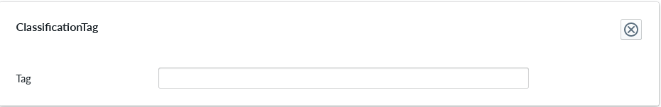
ClassificationTag
Classification tag allows the configurator to assign a custom tag name to a product item. These tags are exposed in the scripting system via the Tags property alongside automatic tags such as role:product and list:*. Use the built-in Contains function to check whether a component or structure has a given tag:
Contains(Tags, 'BottomMAT')
Contains(Root.Bottom.Component.Tags, 'BottomMAT')
| Property Name | Type | Localized | Description |
|---|---|---|---|
| Tag | Text field | N | A label that is associated with the item it's been configured to |
AutoGridComponentRule
AutoGridComponentRule defines a rule that automatically adds components to the grid based on an another component.
![PROPERTY_SET: AutoGridComponentRule]
| Property Name | Type | Localized | Description |
|---|---|---|---|
| Trigger | Part | N | A part that triggers this rule. When this part is added to the grid, the part defined by the AutoOption property is also added to the grid. |
| AutoOption | Part | N | A part that is automatically added. The part is only added if there is a free spot for it. |
| CellOffsetX | Integer | N | The position of the added part relative to the trigger part in number of columns. |
| CellOffsetY | Integer | N | The position of the added part relative to the trigger part in number of rows. |
| AutoRemove | Toggle | N | If enabled, the automatically added part is also automatically removed with the trigger part. |
| EnableChains | Toggle | N | If enabled, this rule can chain with other rules. This means that if the trigger part for this rule is created by an another rule, this rule will be also executed. Cyclic chains are not allowed. |
Grid Logic with Multiple Layers
Different components can be configured to simultaneously occupy the same grid cell. This allows the grid to have multiple layers of components on top of each other. To configure grid layers, you first need to configure area types in the individual parts using the GridOptionProperties.GridCoverSettings property. Multi-cell parts can define different area type for each cell they cover. When area types in the parts have been configured, they appear in the AreaOverlap matrix in the GridConnectivity property set under the grid itself.
The matrix is formed on columns and rows and checkmarks crossing the column and row. A checkmark means that the two area types determined by the row and column are allowed to coexist in the same grid cell. The area overlap rules are symmetric meaning that if A is allowed to overlap B, then B is also allowed to overlap with A. The planner application will leverage the connectivity information and help the user to select appropriate placement and when there only can be one, automatically place the item there.
The connectivity matrix for grid has three possible values for each cell:
- Disallowed (empty cell): the two parts are incompatible and are not allowed to be adjacent.
- Allowed (green checkmark): the two parts are allowed to be adjacent, but are not considered to be connected to each other.
- Connected (lime chain): the two parts form a connection. Connectedness is only used when RequireConnectedness is enabled in the grid root properties. When RequireConnectedness is disabled, there is no difference between the allowed and connected states.