Part
Overview
Part is one main item of the configurator.
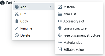
Part can be added to a Structure Logic, like Linear Structure or Free Placement Structure, Product, Item List, Accessory Slot and of course to a part.
To add a part, select it from the context menu of the item that supports adding it
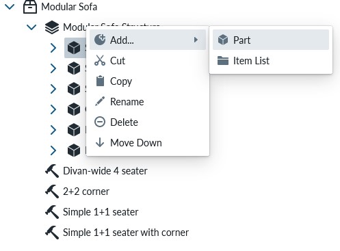
The part provides the following context menu:
Base property
The Base properties of the Part cover thumbnail, name, description and link to the 3D asset which are rendered in the planner. There are control parameters for positioning the 3D asset in the scene and toggles that specify if the part can be selected, shown in measurements and if the part is hidden.
Root Properties
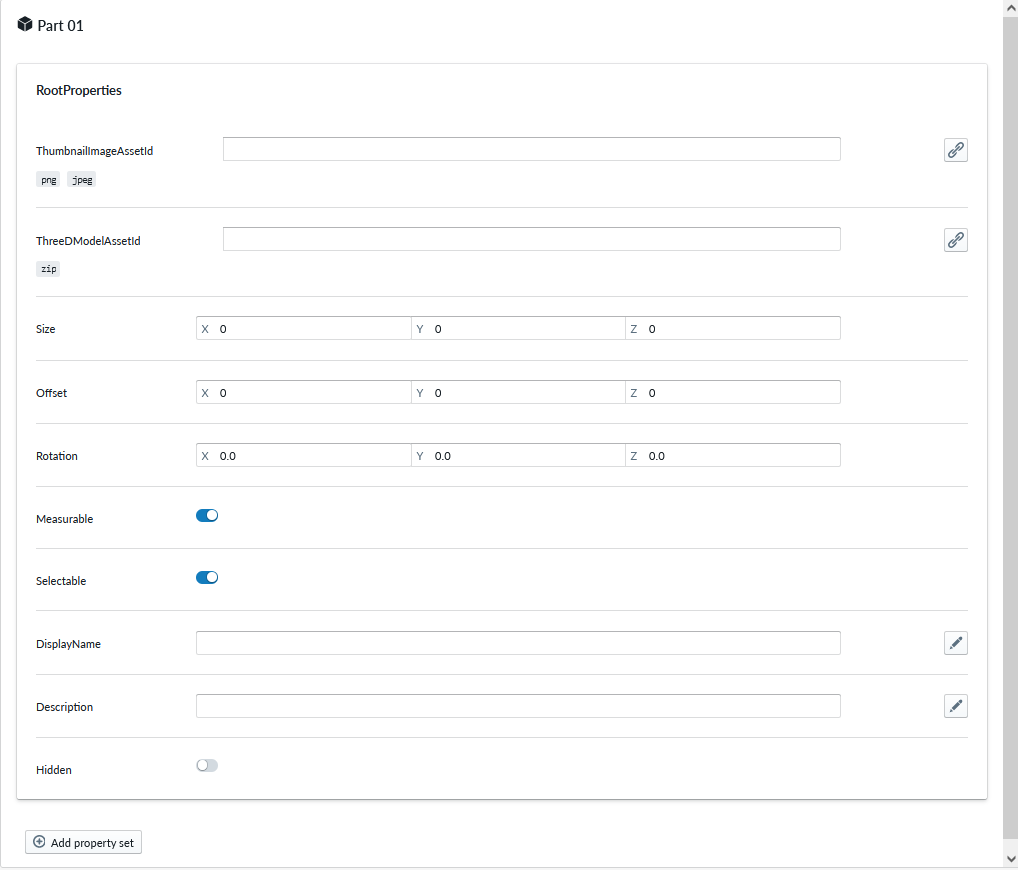
| Property Name | Type | Localized | Description |
|---|---|---|---|
| ThumbnailImageAssetId | PNG/JPEG Asset | N | Thumbnail used for the part to visualise on the Planner |
| ThreeDModelAssetId | GLTF or GLB Asset | N | 3D model asset for the part |
| Size | Vector | N | Size of the bounding box of the 3D model. Size of the actual 3D model will not be affected. You can restore the original value coming from the 3D asset by clicking the reset button if you edit this |
| Offset | Vector | N | Offset of the 3D model from the positioning point. Useful if the 3D model is not centered properly |
| Rotation | Degrees | N | Rotation of the 3D model, useful to align the 3D model in case it is not perfectly aligned at creation time |
| Measurable | Toggle | N | Toggle to enable/disable if the part is shown in measurements |
| Selectable | Toggle | N | Toggle to enable/disable if this item can be selected in the planner view |
| DisplayName | Text field | Y | The short name shown for this part in the Planner, if empty Product title used |
| Description | Text field | Y | The short text shown for this part in the Planner |
| Hidden | Toggle | N | Toggle to hide/make visible the part. Useful to hide parts not needed in composition for example due to editing or other purposes. |
| ElementSelectionMask | Toggle | N | Toggle to apply a selection mask on the part. Makes it easier to select thin parts, especially on touch screens. Also improves performance if the part contains complex geometry. |
Optional property sets
When clicking the Add new property set button for a Part, the available sets are organised into four purpose groups, each sorted alphabetically:
| Group | Property sets included |
|---|---|
| configuration | ConditionalAvailability, CustomProperties, FreelyPlacedOptionProperties, GridOptionProperties, LinearStructureProperties, MaxComponentLimit, Connector (×n), Plug, ScalingPlaneGroup, ValidationRule |
| integration | ClassificationTag, IntegrationData, SalesCodeMapping |
| room planning | MouldingPart, RoomDecorative, WallElement, WallMounted |
| visual | AnimationProperties, ARProperties, CombineOverlappingPlacers, CustomMeasure, DynamicAnimation, MeasureOverride, UnitImage |
The same grouping applies to OptionGroup items, which share the same set of optional property sets as Part.
ScalingPlaneGroup
Plane scaling (resizing) properties for a 3D model based on usually horizontal or vertical plane cutting through the 3D model from specified point. Allows e.g. edges to remain intact while the 3D model scales from the defined plane somewhere in the middle.
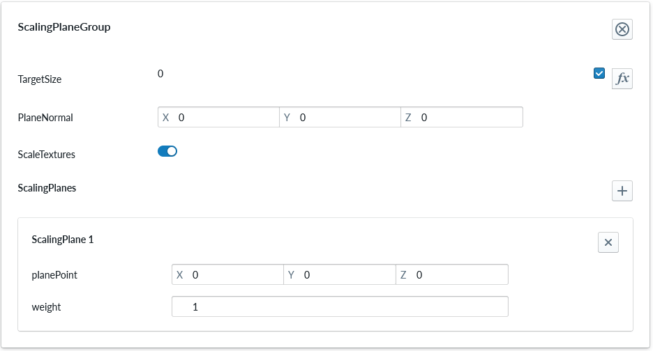
| Property Name | Type | Localized | Description |
|---|---|---|---|
| TargetSize | Scripting | N | Target size after scaling (may be scripted) |
| PlaneNormal | Vector | N | Plane normal defining the plane direction based on normal vector |
| ScaleTextures | Toggle | N | Should the linked materials be scaled appropriately as well |
| ScalingPlanes | Parameter set | N | Scaling planes to be used within the group, with plane point, radius, and weight. By default only single plane is defined. |
Each Scaling Plane has the following properties
| Property Name | Type | Localized | Description |
|---|---|---|---|
| planePoint | Vector | N | Point relative to the center point of the part. |
| radius | Number | N | Width of the transition band around the scaling plane. Vertices between -radius and +radius from the plane scale proportionally, creating a centered smooth transition. Use 0 for a sharp transition at the plane. |
| weight | Number | N | Weight of this plane within the group. |
When radius is greater than 0, the plane behaves as the middle of a scaling zone instead of a hard cut line. This is useful when the geometry should stretch smoothly through the middle section rather than starting the full deformation immediately on one side of the plane.
LinearStructureProperties
Linear structure properties
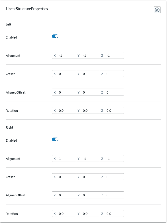
The property set defines the following properties for both 'Left' and 'Right' of the part.
| Property Name | Type | Localized | Description |
|---|---|---|---|
| Enabled | Toggle | N | A toggle to turn on/off the side of the part. Used to define parts that end the composition. |
| Alignment | Vector | N | Positioning the connector placement in 3D space. Used to place the connector on the right placement on the 3D space |
| Offset | Vector | N | |
| AlignedOffset | Vector | N | |
| Rotation | Degrees | N | Rotation of the connection point. Used for angled parts to change the direction of the connection point. Note that this rotation affects the alignment of the connector after rotation |
Additionally, the property set defines these properties.
| Property Name | Type | Localized | Description |
|---|---|---|---|
| IsStartingOption | Toggle | N | Determines if the part can be used as the first part in the structure. A linear structure must have at least one part which has this enabled. |
| MaxComponentsLeft | Number | N | Maximum number of components allowed strictly on the left side of this part inside the linear structure. Use -1 for unlimited. |
| MaxComponentsRight | Number | N | Maximum number of components allowed strictly on the right side of this part inside the linear structure. Use -1 for unlimited. |
MaxComponentLimit
Maximum component limit properties
Use this property set on a part inside a Linear Structure when you want to limit how many instances of that specific part can exist in the same structure.
| Property Name | Type | Localized | Description |
|---|---|---|---|
| Count | Number / scripting | N | Maximum allowed number of instances of this part in the linear structure. Script values are floored to an integer. Use -1 for unlimited. |
| ValidationMessage | Text Field | Y | Localized validation message shown when the current composition exceeds the allowed number of instances, for example after a scripted value decreases. |
Plug
Plug properties
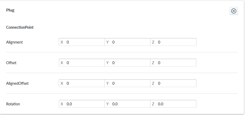
Plug is a counter part to an Accessory slot. It defines the connection point of the accessory part itself and permits using very different accessories in an accessory slot. The plug allows the accessory to define the place where it 'plugs into the (accessory) slot'. It is commonly used with accessories that are placed differently on the parent part and adjusting placement of the accessory slot would not be useful as the accessories need to have different parameters for correct placement. Without a specific plug component on the accessory, the default placement will be used.
| Property Name | Type | Localized | Description |
|---|---|---|---|
| Alignment | Vector | N | The placement of the plug connection point in respective to the part it is defined with. |
| Offset | Vector | N | |
| AlignedOffset | Vector | N | |
| Rotation | Degrees | N | Rotation of the plug connection point in respect to the part it is defined with. Useful for angled accessories or where the 3D model isn't perfectly aligned |
FreePlacedOptionProperties
Free placed option properties
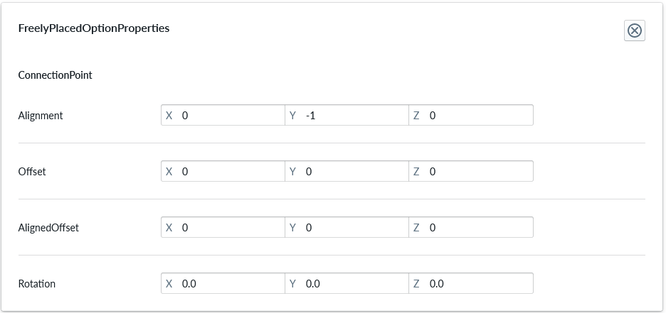
Connection point
| Property Name | Type | Localized | Description |
|---|---|---|---|
| Alignment | Vector | N | |
| Offset | Vector | N | |
| AlignedOffset | Vector | N | |
| Rotation | Degrees | N | Rotation of the connection point on the item. Note that rotation affects the alignment of the connection point after rotation |
GridOptionProperties
Grid option properties
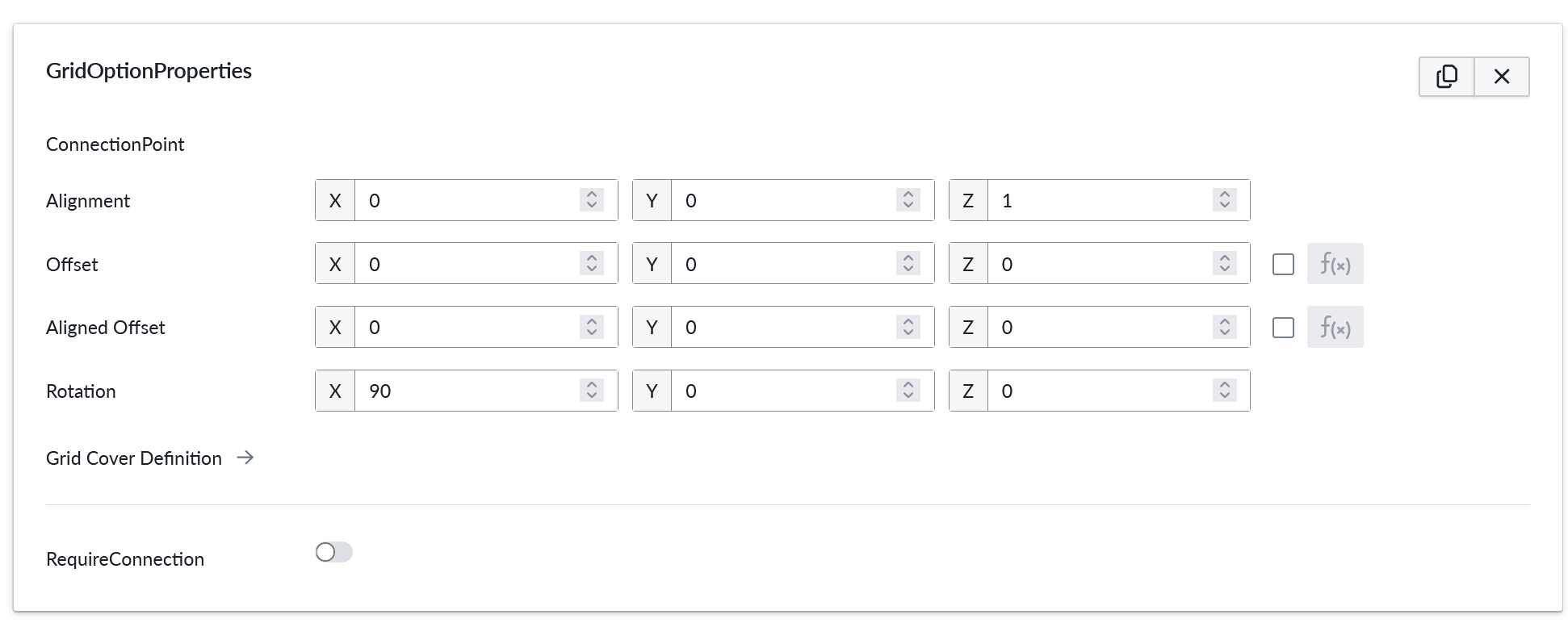
Grid option properties are used for parts inside a grid structure.
| Property Name | Type | Localized | Description |
|---|---|---|---|
| Alignment | Vector | N | The placement of the plug connection point in respective to the part it is defined with. |
| Offset | Vector | N | |
| AlignedOffset | Vector | N | |
| Rotation | Degrees | N | Rotation of the plug connection point in respect to the part it is defined with. Useful for angled accessories or where the 3D model is not perfectly aligned |
| AllowedRotations | Enum | N | Controls automatic runtime generation of rotated grid options. None keeps only the authored orientation, Symmetric generates 0° and 180° variants, and Cardinals generates 0°, 90°, 180°, and 270° variants. These generated variants also rotate grid connectivity definition and connector-related values. |
| Grid Cover Definition | --- | N | A detailed editor which controls how the part connects to the grid. The size of the grid cell is defined here for all grid parts. Additionally, more complex grid part logic can be defined here, such as multi-cell components and area, edge, and corner types which factor into the grid connectivity rules. For more information, see Grid Cover Definition. |
| RequireConnection | Toggle | N | If enabled, this part must form a connection with an another component in the grid. and can not be the first component. This check considers only local connectivity, as opposite to the RequireConnectedness on grid level. If all the connected parts are removed, this component will be automatically removed as well. |
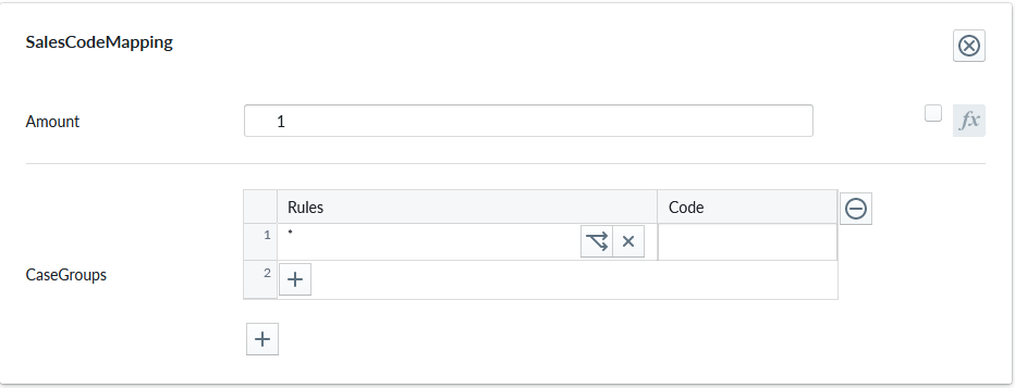
SalesCodeMapping
SalesCodeMapping property set is used to define the logic to determining SKU (Stock-Keeping Unit) codes used for integrations and Summary. When integrating the 3D ecommerce configurator with eCommerce platforms, both must explicitly know the same set of SKUs in order for the configurator to be able to show proper prices and map the composition configuration to an order (Add To Cart)
| Property Name | Type | Localized | Description |
|---|---|---|---|
| Measurand | Radio Button | N | The unit type of the Amount: Count, Length, Area, Volume, Weight, Time |
| Amount | Scripting | N | The defaul number of units each item where this property is defined will be counted, typically 1, but occasionally something else based on logic |
| Tags | String List | N | Tags that categorize this sales code mapping. Defaults to a single tag ("Common") |
| CaseGroups | Logic Fields | N | For each logic group, a selection of case split logic rules in the rule field that define an outcome code into the code field. * denotes applies to all definition A case-split can be based on scripting logic, a child condition (eg. material slot or accessory slot selection), Multiple case groups perform an composed SKU code. Refer to Sales Code Mapping for more information |
The Measurand specify what kind of a measurement is the Amount... It can be a number of element (Count) or measurements (Length, Area, Volume, Weight, Time ). In case of measurements the entered value is in standard unit system in meters. In the shown example 1.5 for Measurand=Area, it means 1.5 square meters. these will be shown on the planner according to the selected unit system. For example if the selected unit system is cm, then the displayed value is 15000 square cm. The conversion will be done also in imperial measures.
Tags are free-form, case-insensitive strings used to enable or disable this mapping at runtime based on the selection per site. The Tags can be enabled for each site.
There is a list there (In "Site Configuration" > "Product Catalog" > "Tags" (from the "..." context menu) of all tags found in all SalesCodeMappings from product or part level recursively.
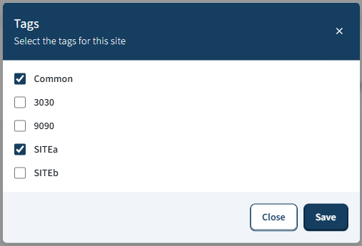
On publishing only the SalesCodeMappings with enabled Tags, will be taken into account.
Note
The same library tag catalog is reused by the SiteVisibility property set on pre-built compositions, parts, and materials. Enabling or disabling a tag on a site affects both SKU mapping filtering and option visibility (pre-built compositions, parts, and materials). See SiteVisibility property set for details.
Tags behavior:
- Comparison is case-insensitive (OrdinalIgnoreCase).
- Duplicates should be avoided; only one matching tag is required to enable the mapping.
- Back-compat: legacy data without tags is initialized to the default "Common" tag.
Tags examples:
- ["Online", "B2B"] enables this mapping when either "online" or "b2b" is enabled at runtime.
- ["Common"] (default) keeps the mapping generally available unless a stricter tag set is enforced.
For admin users there is a way to edit the skus in an external text file and import it back.
Parts and Products have two extra context menus, exportSKUs and importSKUs:
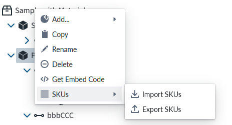
This is usefull especially in the case that there are hundreds of entries. Editing those one by one would be practically impossible.
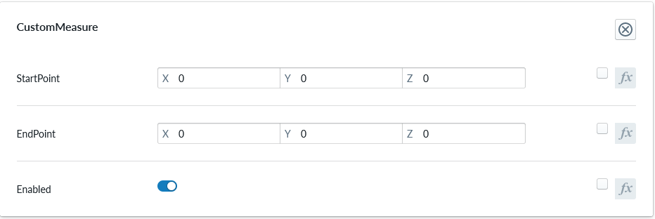
CustomMeasure
Custom measures
| Property Name | Type | Localized | Description |
|---|---|---|---|
| StartPoint | Vector/scriptable | N | Starting point of the measurement line. Can be dynamic based on scripting |
| EndPoint | Vector/scriptable | N | Ending point of the measurement line. Can be dynamic based on scripting |
| Enabled | Toggle/scriptable | N | Toggle to enable/disable this custom measure. Can be dynamic based on scripting |
MeasureOverride
Measure override allows customizing the size of the reported measures for a part. This is useful when the size of the measures should be different than the size used for the building and connection logic.
![PROPERTY_SET: MeasureOverride]
| Property Name | Type | Localized | Description |
|---|---|---|---|
| Size | Vector/scriptable | N | Measured size of the part. |
| Offset | Vector/scriptable | N | Offset for the center of the measures. This value allows the measurements to have a different center point than the 3D model. |
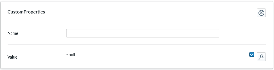
CustomProperties
Custom Property set (or sets) allow definition of logic that defines something that otherwise is not predefined in the system logic.
| Property Name | Type | Localized | Description |
|---|---|---|---|
| Name | Text field | N | The name of the custom property. It can be referred to from other scripts |
| Value | Scripting | N | Value or scripting logic that the property has |
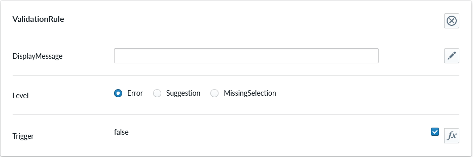
ValidationRule
Validation rule property set is used to define logic that can be useful to ensuring the item where the validation rule is will follow define rules.
| Property Name | Type | Localized | Description |
|---|---|---|---|
| DisplayMessage | Text Field | Y | Text that is shown on the Planner when the conditions of the rule are true |
| Level | Radio Button | N | Selection should the rule show error, suggestion or indicating something is missing |
| Trigger | Scripting | N | The logic that defines the validation rule |
Note
Validation rule level states correspond the next error levels. Error => "Error" Missing Selection => "Warning" Suggestion => "Info"
If the "add to cart" button is available, in case we have an error, the add to cart button will be disabled and not clickable until the error is fixed.
ClassificationTag
Classification tag allows the configurator to assign a custom tag name to a product item. These tags are exposed in the scripting system via the Tags property alongside automatic tags such as role:product and list:*. Use the built-in Contains function to check whether a component or structure has a given tag:
Contains(Tags, 'BottomMAT')
Contains(Root.Bottom.Component.Tags, 'BottomMAT')
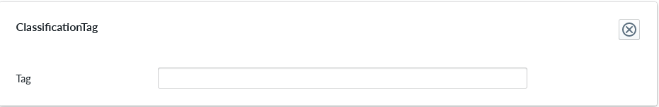
| Property Name | Type | Localized | Description |
|---|---|---|---|
| Tag | Text field | N | A label that is associated with the item it's been configured to |
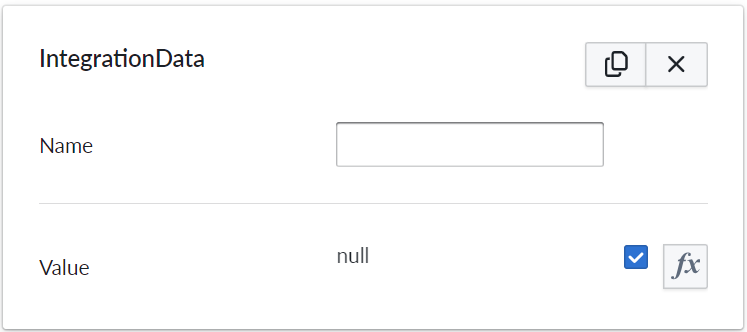
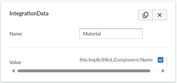
IntegrationData
Integration data property set is used to add metadata to product parts and / or materials.
| Property Name | Type | Localized | Description |
|---|---|---|---|
| Name | Text field | Y | The name of the integration data property. It can be referred to in scripting from elsewhere |
| Value | Scripting | N | Value or scripting logic that the property has |
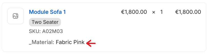
Example of how this might look in the SalesData json:
     "properties": {
        "Material": "Fabric Petrol"
     },
Originally our product summary / Bill of Materials(BOM) has listed and counted items(parts of the composition) based on SKU's. When using integration data, the list takes the provided metadata into account while summarizing items.
This change means that parts with identical SKU's but different integration data (colors or materials specified) are treated as separate items in the summary / BOM.
Example of usage
Some e-commerce platforms have product variant limits, which hinders stores that have a vast variety of colors and materials. Using integration data property set in manager (management.vividworks.com), material and color options can be put to product parts metadata.
This removes the need for putting SKU's for materials, thus also removing the issue of product variant limit.
How above example would work and look in Shopify
In Shopify, the visibility of data can be configured with two options:
The data can be displayed to both the shop owner and to the customer. It would be visible in cart and checkout (and for shop owner only, in 'orders' tab in Shopify admin view.) This can be implemented using Shopify's cart line item properties.
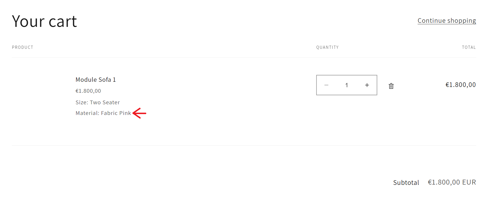
Red arrow in above image shows the result of configuring integrationdata in the way of the example.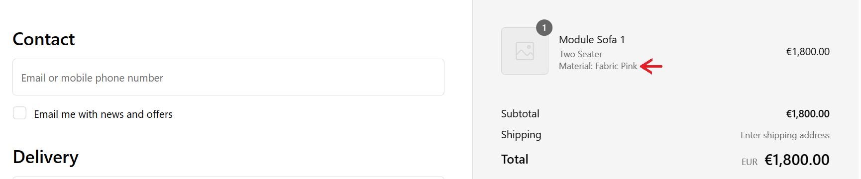
Red arrow in above image shows the result of configuring integrationdata in the way of the example.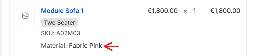
Red arrow in above image shows the result of configuring integrationdata in the way of the example.The data can be set to display only to the shop owner, in 'orders' tab in Shopify admin view. This can be implemented using Shopify's cart line item hidden properties. This way, the end customer will not see the metadata at all.
Red arrow in above image shows the result of configuring integrationdata in the way of the example.
Conditional Availability
Conditional availability is used to dynamically enable or disable an option based on a script. It applies to material and accessory slots and to linear structures. If the available script evaluates to false, the option is hidden from add and replace menus in Planner.
An option can also become unavailable after it has already been added to the composition. In that situation, the runtime resolves the invalid content in this order:
- If
ErrorMessageOnlyis enabled, the option stays in place and Planner shows the validation message. - Otherwise, if
Replacementis configured, the runtime follows the replacement chain and uses the first allowed replacement. - For linear structures only, if no allowed replacement is found and the invalid component is at either end, that end component can be removed.
- If the content still cannot be auto-healed, the invalid option stays in place and Planner shows the validation message.
ErrorMessageOnly takes precedence over Replacement. When the boolean flag is enabled, the replacement dropdown selection is ignored and no automatic replacement is attempted.
For MustBeConnected slots, configure the options so that at least one allowed option exists for every relevant state. If no allowed replacement exists, Planner now surfaces a validation error instead of silently choosing an arbitrary fallback.
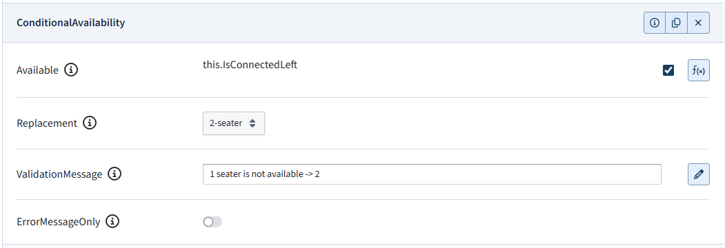
| Property Name | Type | Localized | Description |
|---|---|---|---|
| Available | Script true/false | N | A scripted condition which determines whether this option is currently available. |
| Replacement | Option | N | Replacement option to try first if this option becomes unavailable after it has already been selected. Replacement chains are allowed; the first allowed replacement is used. |
| ValidationMessage | Text field | Y | Localized planner validation message shown when unavailable content must remain in the composition. |
| ErrorMessageOnly | Toggle | N | Prevents automatic replacement and shows ValidationMessage instead. This flag takes precedence over the Replacement selection. |
Dynamic Animation
The Dynamic Animation property set allows you to attach animations to otherwise static 3D assets. It provides a range of properties for animating both position and rotation in flexible ways. This property set is particularly useful for creating animations for interactive elements such as doors, drawers, or other hinged objects.
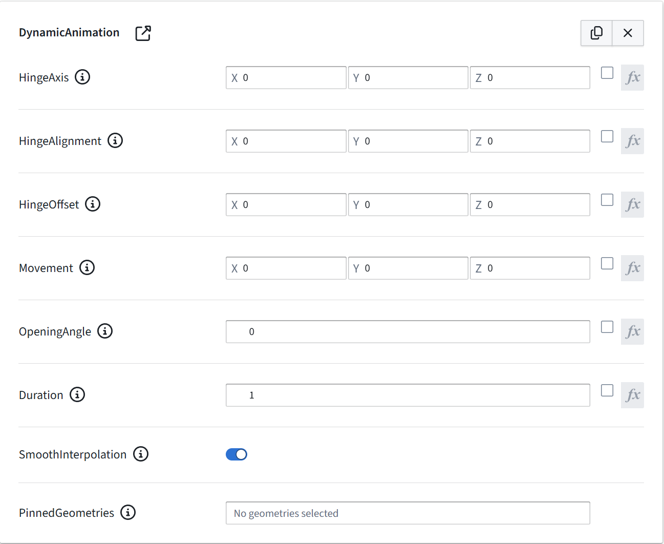
| Property Name | Type | Localized | Description |
|---|---|---|---|
| HingeAxis | Vector3 | N | Defines the axis of rotation for the door. For standard sideways‑opening doors, use 0 1 0 (rotation around the Y‑axis). |
| HingeAlignment | Vector3 | N | Specifies the edge of the geometry used as the hinge. For example, hinges on the right‑back edge would use 1 0 1. Hinges on the left side would use -1 0 1. Setting -1 0 -1 rotates the door around the left‑front edge. |
| HingeOffset | Vector3 | N | Works in combination with HingeAlignment. While alignment defines the hinge edge, offset specifies the distance (in meters) from that edge. This is useful when the hinge pivot is positioned slightly behind the door’s back surface. |
| Movement | Vector3 | N | Defines translation along the local axis (in meters). This can shift the door’s position during animation. For example, many kitchen doors move slightly inward and outward while opening to ensure proper clearance and tight gaps when closed. |
| OpeningAngle | Number (degrees) | N | The rotation angle (in degrees) for the opening animation. |
| Duration | Number (seconds) | N | Specifies the animation duration in seconds. Default: 1. |
| SmoothInterpolation | Toggle | N | Determines whether the animation uses smooth easing (ease‑in/ease‑out) or linear interpolation. Default: True. |
| PinnedGeometries | List | N | Identifies geometry nodes excluded from the animation. These remain static while other parts move. |
AnimationProperties
Animation properties
![PROPERTY_SET: AnimationProperties]
| Property Name | Type | Localized | Description |
|---|---|---|---|
| Enabled | Toggle/scriptable | N | Toggle to enable or disable the animation. Can be dynamic based on scripting |
| SelectedPlayMode | Radio Button | N | Play mode to be used for palying the animation. |
| Animations | Drop Down | N | Allows selecting an animation out of the animations found in 3D model configured for the part. |
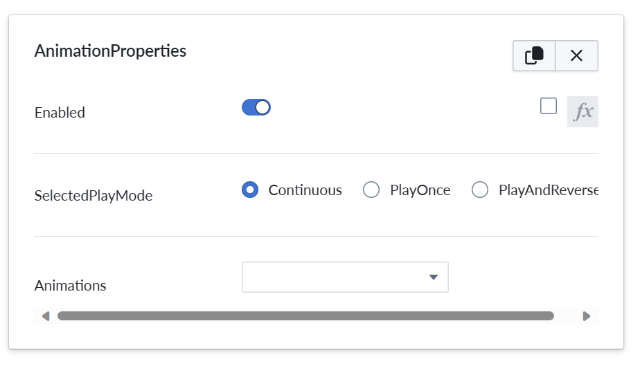
Currently only single Animation properties propertyset can be added per part.
Play modes
| Play mode name | Description |
|---|---|
| Continuous | Animation starts playing from begin to end on repeat. Started with animation play button and stopped on second press. |
| PlayOnce | Animation plays from start to finish once and resets to original state. So starts from beginning on each press of play button |
| PlayAndReverse | Animation plays to end, but stays in final state until played again. Plays in reverse the second time. |
ARProperties
The ARProperties is an optional property set specific for Parts. It controls the appearance of a part in the virtual space. Currently only single "ARProperties" propertyset can be added per part.
![PROPERTY_SET: ARProperties]
| Property Name | Type | Localized | Description |
|---|---|---|---|
| Visibility | Radio Button | N | Controls the visibility of an item and children in AR view. |
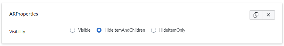
AR visibility modes
| Visibility modes name | Description |
|---|---|
| Visible | Default behavior. Item and children are visible |
| HideItemAndChildren | Item and its children are hidden |
| HideItemOnly | Item is hidden while the children will remain visible |
Note
This property is consistent also with the downloaded 3d glb model from the 3D Scene. (The GLB Download is a feature turned on or off at tenant level based on your license).
UnitImage
UnitImage is used to enable unit image capture(s) on a composition at the product level or on a selected part which allows to see the thumbnail from a certain angle or even more angles. You can create as many UnitImage property sets as you want, each one will create a capture, for the composition if you add it under a product or for a part. If the property set is not added a default capture will be generated. When this property set is used, the currently selected colors and accessories are included in the image shown in the summary page instead of the fixed image. The camera angle and parameters can be adjusted for the unit image capture.
![PROPERTY_SET: UnitImage]
| Property Name | Type | Localized | Description |
|---|---|---|---|
| CameraAngleX | Number (degrees) | N | Camera altitude angle. A value of 0 captures the image from the front and 90 captures directly above. |
| CameraAngleY | Number (degrees) | N | Camera directional angle. A value of 0 captures the image from the front, 90 from right side, 180 from behind, and 270 from left. |
| CameraFov | Number (degrees) | N | Field of view angle for the camera. Should be in range 5-120. Small angles generally lead to visually better results as the unit images are quite small in size and commonly shown next to each other. |
| VisibleInParentCapture | Radio Button | N | Determines the visibility of this component when capturing an unit image of a parent component. |
| ImageWidth | Number (pixels) | N | Capture image width in pixels. Must be between 128 and 4096. Defaults to 512. |
| ImageHeigth | Number (pixels) | N | Capture image height in pixels. Must be between 128 and 4096. Defaults to 512. |
Note
The Summary page will show the multiple captures for both composition and parts.
The PDF view will show only the composition captures at the header level for saving space in the printed form.
Unit image visibility modes
| Visibility modes name | Description |
|---|---|
| Visible | Item and children are visible. |
| VisibleHideChildren | Item is visible while the children will be hidden. |
| HideThisOnly | Item is hidden while the children will remain visible. |
| HideThisAndChildren | Default behavior: Item and its children are hidden. |