Product
Overview
The Product is the primary top level item on the 3D product configurator. All the items under it are providing data in various ways to the product. Parts define the elements that can be composed up to a product, Materials define what kind of surfaces parts have and Accessories define the options parts have. Structure rules define how the assembly of parts is done through definition of logic and construction logic. And optional propertysets refine the assembly behavior or help construct needed data for integration (like SKU or editable value).
The Product item itself manages both the lifecycle of the offering made visible to the planner and serves as the place where top level data is defined. The product item has Base Properties and few optional propertysets that are listed below.
Add a product item
To add Product item, open context menu on the "Products" Category
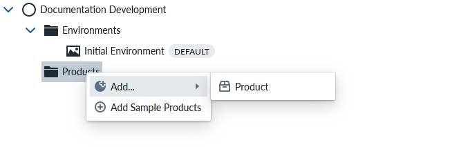
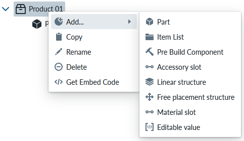
Product context menu
You can add Part, Option Group, Item List, Pre Built Component, Accessory Slot, Linear Structure, Free Placement Structure, Material Slot and Editable Value to the product thorough the Product context menu.
Base property overview
Base properties for Product cover the most important product lifecycle parameters, like publishing the version to the planner and name and descriptions shown by the planner
RootProperties
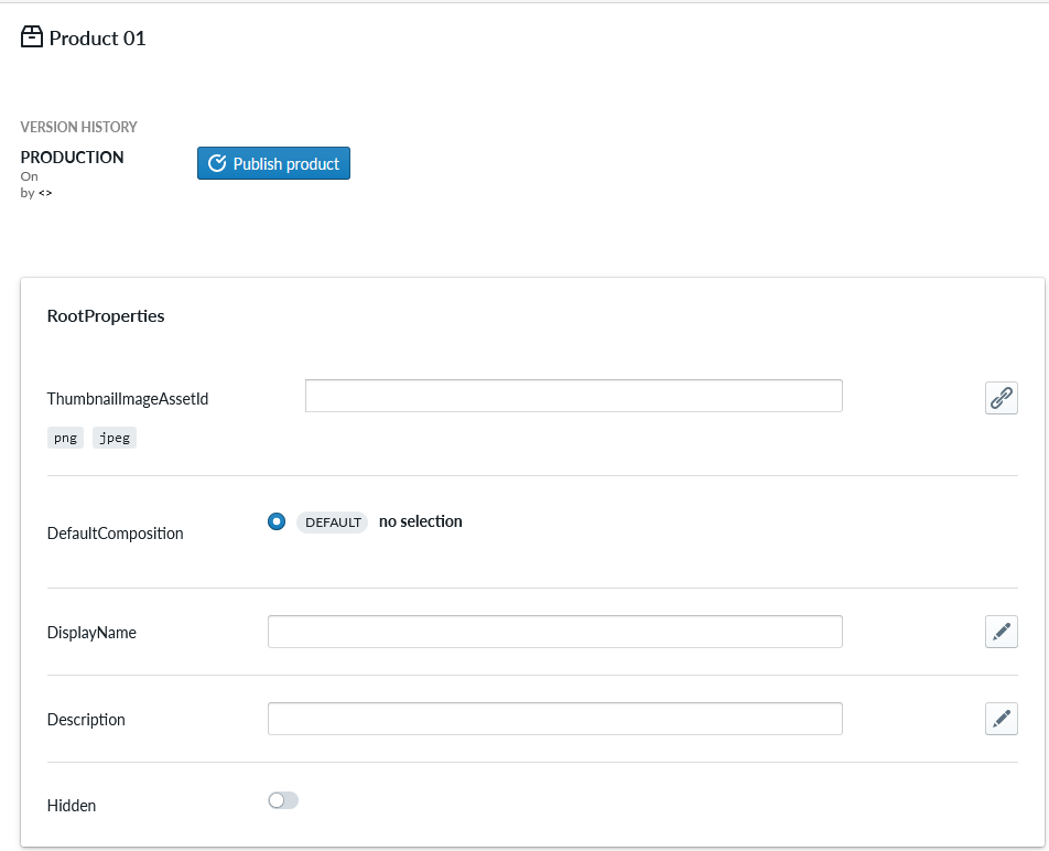
Version History
When using this product library, publishing the product sets the version live for all planner instances linked to this product library. This way you can test and develop versions within the Management UI environment and only publish the versions you want to live Planner versions.
Root Properties
![ITEM_TYPE: Product]
| Property Name | Type | Localized | Description |
|---|---|---|---|
| ThumbnailImageAssetId | PNG/JPEG Asset | N | Link to an image asset of the product to be shown on the various panels of the Planner |
| DefaultComposition | Radio Button | N | Radio-button selection of the Pre Built Components made in this product as the initial one loaded to the Planner scene, empty when no pre-built compositions have been made |
| DisplayName | Text field | Y | The text to be shown on the Planner for the Product |
| Description | Text Field | Y | The description text shown on the Planner under the DisplayName |
| Hidden | Toggle | N | Toggle to hide the product from the Planner, typically used then as a container product for shared resources across products in the product library |
| MeasureSticksEnabled | Toggle | N | Enables the measure sticks |
| MeasureSticksWarningEnabled | Toggle | N | Enables a warning telling that the measures might not be precise |
| ShowSummaryMeasures | Toggle | N | Shows the formatted measures for composition and parts in Summary and PDF views |
| ShowPlacersForReplaces | Toggle | N | Shows the placers for replace edits |
Regardless of the DefaultComposition selection, the Manager automatically regenerates the selected product whenever you open a 3D preview (planner links or embedded viewer) or launch the Pre Built Component editor. That automation keeps the viewer in sync and removes the previous requirement to remember a manual regenerate immediately before editing pre-builts; you can still trigger the regenerate manually when you want to refresh multiple products at once or review warnings ahead of time.
Note
The parts in the scene are connected to the product with an (implicit) Slot. The MustBeConnected property is true by default for this implicit Slot. As a result, even when the DefaultComposition is set to "None," you will still see a composition in the scene, as the parts are required to be connected. To ensure that the scene is empty by default when the DefaultComposition is set to "No selection," you need to explicitly create a Slot to hold the parts. By doing this, you can then set the MustBeConnected property of the explicit Slot to false, which will allow the scene to be empty when the DefaultComposition is set to "No selection."
Optional property sets
Optional Propertysets include mapping of composition items into Sales Codes for price and cart integration purposes and propertyset for localization of the categories of the planner selection groups like Materials and Accessories plus some useful additional propertysets.
SalesCodeMapping
SalesCodeMapping property set is used to define the logic to determining SKU (Stock-Keeping Unit) codes used for integrations and Summary. When integrating the 3D ecommerce configurator with eCommerce platforms, both must explicitly know the same set of SKUs in order for the configurator to be able to show proper prices and map the composition configuration to an order (Add To Cart)
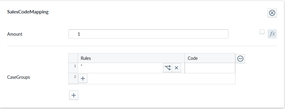
| Property Name | Type | Localized | Description |
|---|---|---|---|
| Measurand | Radio Button | N | The unit type of the Amount: Count, Length, Area, Volume, Weight, Time |
| Amount | Scripting | N | The defaul number of units each item where this property is defined will be counted, typically 1, but occasionally something else based on logic |
| Tags | String List | N | Tags that categorize this sales code mapping. Defaults to a single tag ("Common") |
| CaseGroups | Logic Fields | N | For each logic group, a selection of case split logic rules in the rule field that define an outcome code into the code field. * denotes applies to all definition A case-split can be based on scripting logic, a child condition (eg. material slot or accessory slot selection), Multiple case groups perform an composed SKU code. Refer to Sales Code Mapping for more information |
The Measurand specify what kind of a measurement is the Amount... It can be a number of element (Count) or measurements (Length, Area, Volume, Weight, Time ). In case of measurements the entered value is in standard unit system in meters. In the shown example 1.5 for Measurand=Area, it means 1.5 square meters. these will be shown on the planner according to the selected unit system. For example if the selected unit system is cm, then the displayed value is 15000 square cm. The conversion will be done also in imperial measures.
Tags are free-form, case-insensitive strings used to enable or disable this mapping at runtime based on the selection per site. The Tags can be enabled for each site.
There is a list there (In "Site Configuration" > "Product Catalog" > "Tags" (from the "..." context menu) of all tags found in all SalesCodeMappings from product or part level recursively.
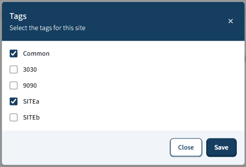
On publishing only the SalesCodeMappings with enabled Tags, will be taken into account.
Note
The same library tag catalog is reused by the SiteVisibility property set on pre-built compositions, parts, and materials. Enabling or disabling a tag on a site affects both SKU mapping filtering and option visibility (pre-built compositions, parts, and materials). See SiteVisibility property set for details.
Tags behavior:
- Comparison is case-insensitive (OrdinalIgnoreCase).
- Duplicates should be avoided; only one matching tag is required to enable the mapping.
- Back-compat: legacy data without tags is initialized to the default "Common" tag.
Tags examples:
- ["Online", "B2B"] enables this mapping when either "online" or "b2b" is enabled at runtime.
- ["Common"] (default) keeps the mapping generally available unless a stricter tag set is enforced.
For admin users there is a way to edit the skus in an external text file and import it back.
Parts and Products have two extra context menus, exportSKUs and importSKUs:
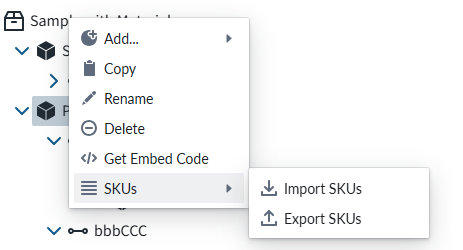
This is usefull especially in the case that there are hundreds of entries. Editing those one by one would be practically impossible.
CategoryNameLocalization
Category name localization
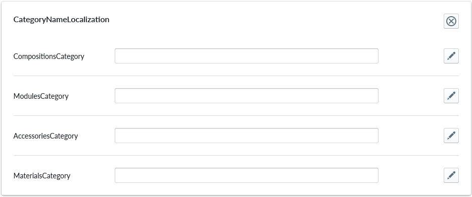
| Property Name | Type | Localized | Description |
|---|---|---|---|
| CompositionsCategory | Text field | Y | Text shown for the Compositions (Pre Build Components) category menu on the Planner |
| ModulesCategory | Text field | Y | Text shown for the Modules (parts) category menu on the Planner |
| AccessoriesCategory | Text field | Y | Text shown for the Accessories category menu on the Planner |
| MaterialsCategory | Text field | Y | Text shown for the Material category menu on the Planner |
Note that further submenus can be made in the categories menu. This is done by adding ItemLists under the appropriate item, for example ItemList under Material Slot. The subcategory name is defined with the CategoryName property of the ItemList in Root Properties
LibraryCategoryStructure
Library category structure allows modifying the structure of Planner menu. One can select which items are allowed to be shown in which category as well as freely arrange, add, or remove categories.

| Property Name | Type | Localized | Description |
|---|---|---|---|
| CategoryStructure | CategoryStructure | N | Library category structure enables customization of the Planner menu by allowing users to modify item categorization, arrangement, and visibility, offering flexibility beyond the rigid default structure defined by the Manager tree view. |
It also allows arranging items (e.g. modules, materials and accessories) within the categories, so that their order differs from the order defined by Manager tree view.
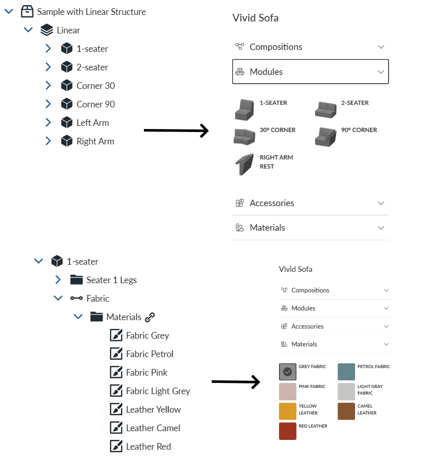
Without LibraryCategoryStructure the Manager tree view rigidly maps item placement and order based on their type and order. There are the four default categories, and items are placed under those in same order as they appear in Manager. See image below for illustration of this where Parts under linear structure are placed under modules in planner in same order as they appear in Manager's product tree view. And same goes for materials, so their order is strictly defined by item order and they are always placed under Materials in Planner's menu.
Library Category Structure Categories view
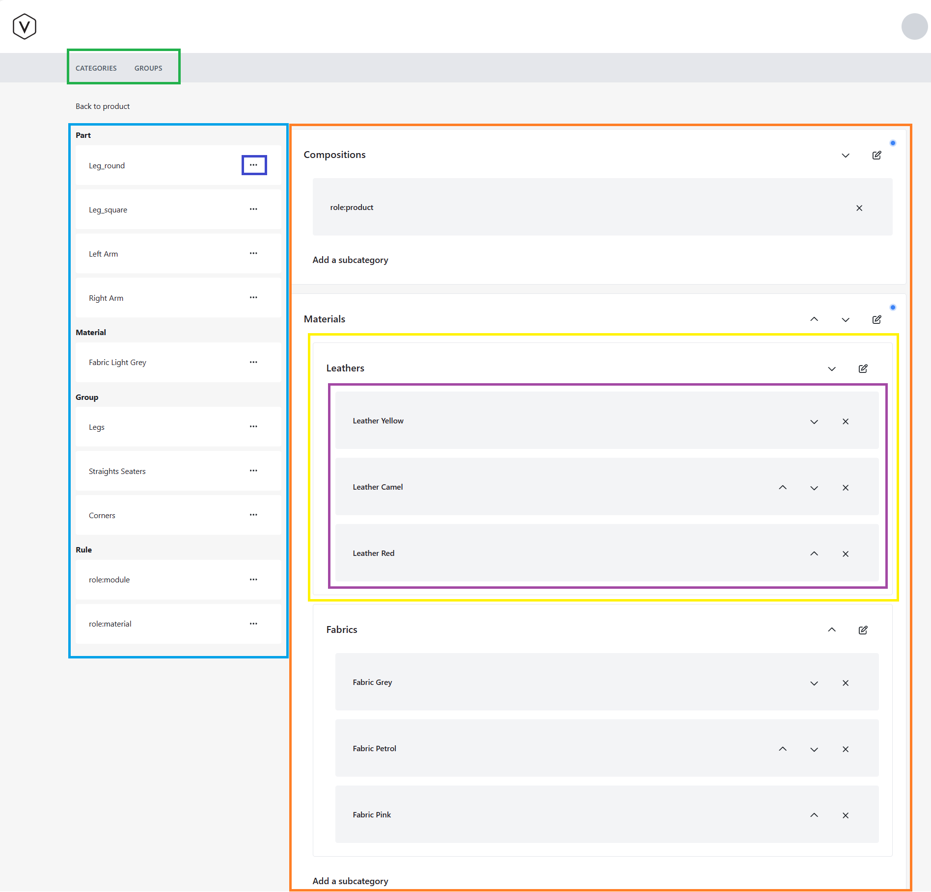
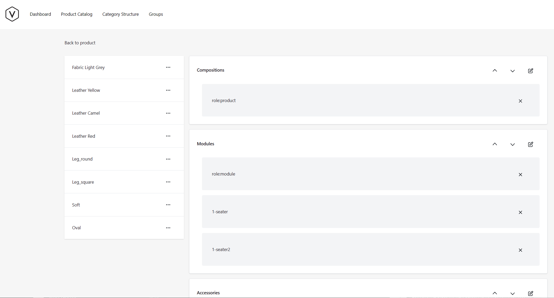
Here is an explanation of category structure categories view. Areas to be explained here are highlighted in below image with colored boxes and explanation for the area highlighted by each color is listed below.
GREEN: The view selection, with two views currently available. The categories view (also seen below) and the grouping view for creating new grouped items.
LIGHT BLLUE: Unplaced items area is on the left hand side of the view. It includes items that are available for placement to the categories, but have not been placed anywhere. The unplaced items are divided into labelled sections, each identified by a type icon in the section heading. "Part" and "Material" sections list all parts and materials not placed to any category. "Group" contains groups that have been built with the grouped items view. "Rule" contains all the rule items (default rule items with "role:" prefix or tag rules). Each item row has a menu button (⋮) that opens a list of available categories to assign it to.
INDIGO: On item placement area you can see a menu button (⋮) on each item row. Clicking it will show the category listing, to place item into one of the categories (or subcategories).
ORANGE: Highlights the Categorization area, which consists of main categories, sub categories and items for each of those. There are also controls for ordering categories, subcategories and items. Changing the order of items happens by pressing the arrow buttons next to an item (or category). The order is reflected to order of planner menu's (on regenerate/publish).
YELLOW: Highlights one of the subcategories. In this case subcategory called Leathers placed under materials.
PURPLE: Items placed to category or subcategory. Items can be removed from category by pressing X button on the right hand side of each item. Items can be also ordered within a category/subcategory.
Subcategories
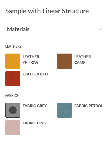
Categories can be split into sub categories, which add additional grouping for the items in the planner menus. This is useful for arranging selections that have some similarities close to each other. Order of subcategories within categories can be updated from category structures categories view. Image below shows materials from sample sofa arranged to subcategories named Leathers and Fabrics.
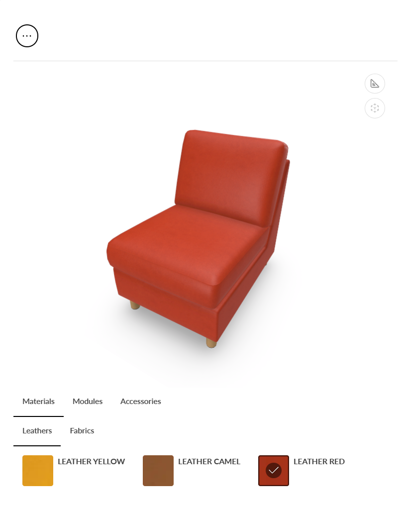
Here is also an image showing how the subcategories appear in planner app when using mobile device.
Tag rules
It is possible to also arrange items to categories, by tagging them and utilizing auto-generated tag rules (tag rules are created or updated when pressing regenerate in Products view). Tag rules get created when a ClassificationTag property set is placed on one of the Parts or Materials in the Manager's Products view. After creating a classification tag to a material it can be copied and pasted to multiple parts or materials at once, by doing multi-select.
Ordering the parts or materials within a tag rule is still possible. Working with tag rules can make organizing to categories and subcategories easier when there is large amount of items and you would rather work in Products view and apply categories to lots of items at once.
Taking library category structure into use
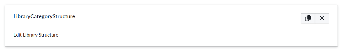
Add property set LibraryCategoryStructure to your Product in Manager's Products tree view
Go to library categories view by clicking on the link with text "Edit Library Structure" on the property set.
Start doing changes like Adding categories, renaming/localizing them, adding or reordering items within categories
Left hand side of the view shows items (including Parts, Materials and Accessories) as well as any groups created in Groups view, that are not placed to any of the categories yet.
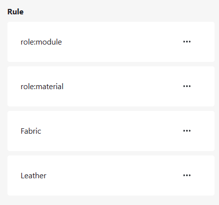
Note how each of the initial category contains item starting with "role:", this is a filter which makes sure all the items belonging to the default categories are placed into that category. So all materials are placed into materials. Roles can be translated as they appear under the summary view, in a similar way as the categories.
Root level Parts (from Products tree view) are placed under Modules. Parts under other parts (in Products tree view) are in accessories. Prebuilt compositions are under Compositions. For the consistency sake they also can be translated here as by changing the DisplayName property of each Part in its property view.
Groups can also be translated here. Same translation for the display name can also be done in the Groups tab view for each group.
The Translate item dialog is similar with the category dialog
Moving items to categories and subcategories
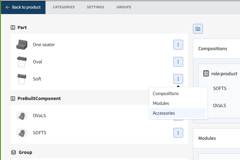
One of the main functionality allowed by library category structure is moving items from unplaced items area to categories and subcategories. This happens by clicking the menu button (⋮) on an unplaced item (like "Soft" headrest on image below) and selecting a category or subcategory from the listing that appears. In this case we would want to place the item to subcategory "Accessories", so we would click button with that name. After completing the click the item will get removed from unplaced items area and appear in the selected category or subcategory.
Grouping items with library category structure
Category structure and the related view also allows to group items under single item on the planner menu selection area. So say you want two modules (Parts in Products tree view) to appear as only a single selection on the planner.
Grouping best fits scenarios where there are lots of size options e.g. for accessory parts, but they might not be overlapping. Think of shelves of a cabinet, where cabinets have varying width and you want placing shelves on them to be as simple as possible. So configuring grouping makes all those options appear under a single consolidated selection under planner menu selection area.
Grouping example
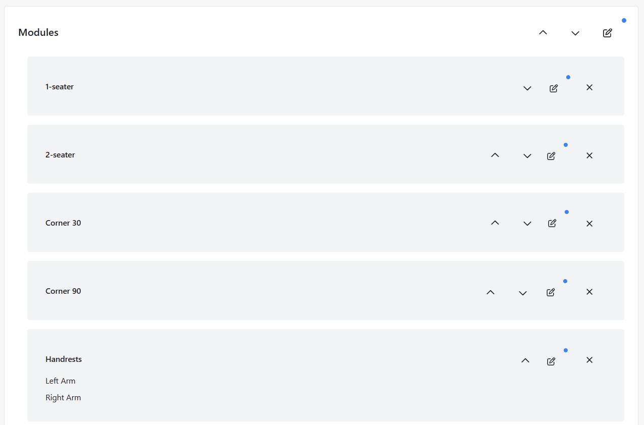
Here is an example of how grouping two handrests of sample linear structure sofa under a single Planner menu selection.
In manager app's products view:
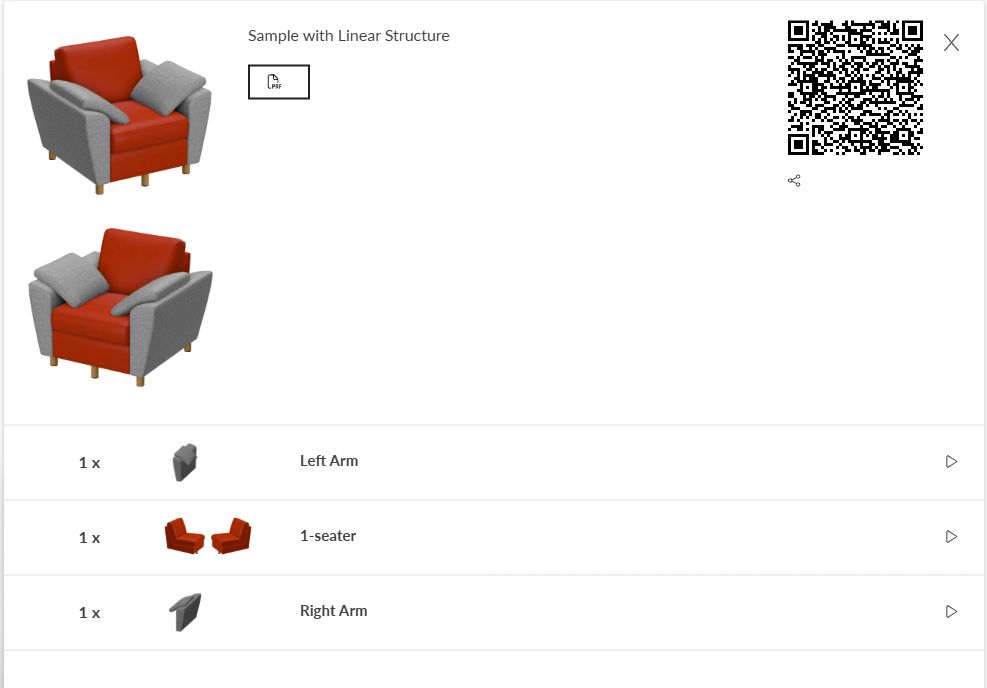
Add "Sample with Linear Structure" to you library
Add "LibraryCategoryStructure" property set to the product
Go to library categories view
Press Groups from top of the view
Press "Create group"
Name your group as "Handrests" (Optionally: Add name and description for all available languages)
Tick the "Left Arm" and "Right Arm" from the right hand side selections
- This selects which selections are grouped
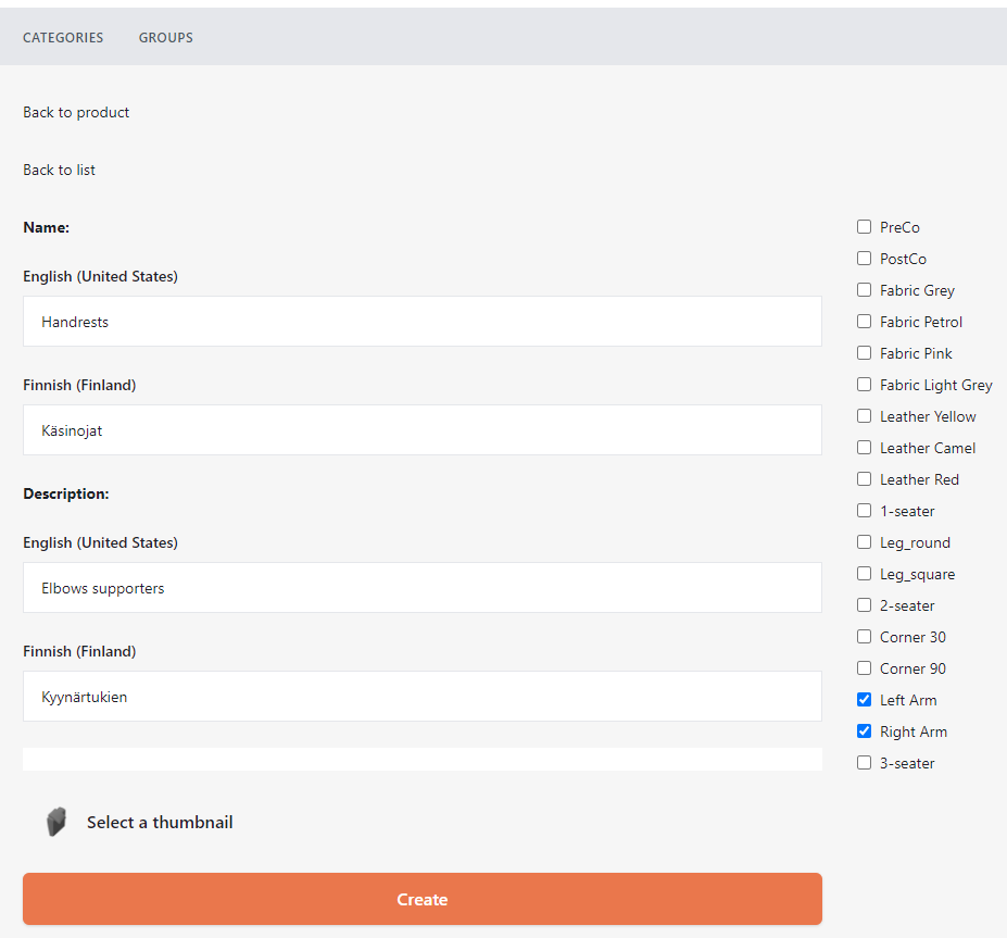
Press Create button
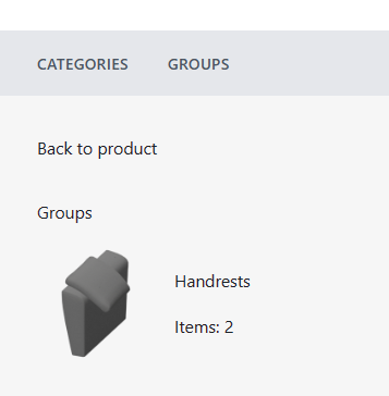
Groups view now shows the "Handrests" under Groups listing
Go to back to categories view (by clicking Categories)
"Handrests" now appears under "Groups" on the left hand side listing
- Meaning it has not yet been assigned to any category
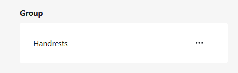
Assign the "Handrests" group under Modules category (by pressing the menu button (⋮) on it and selecting modules)
- We could now already go and regenerate the product and see the new menu selection area item on planner app, but let's do a bit more and remove the "Left Arm" and "Right Arm" as single selections first.
Remove the "role:module" from Modules category by clicking "X" button next to it
Now add all the seater and corner items back to Modules one by one from Part listing on the left
Finally reorder items within the Modules by moving Handrests to the bottom of the category
- Modules category should now appear as below
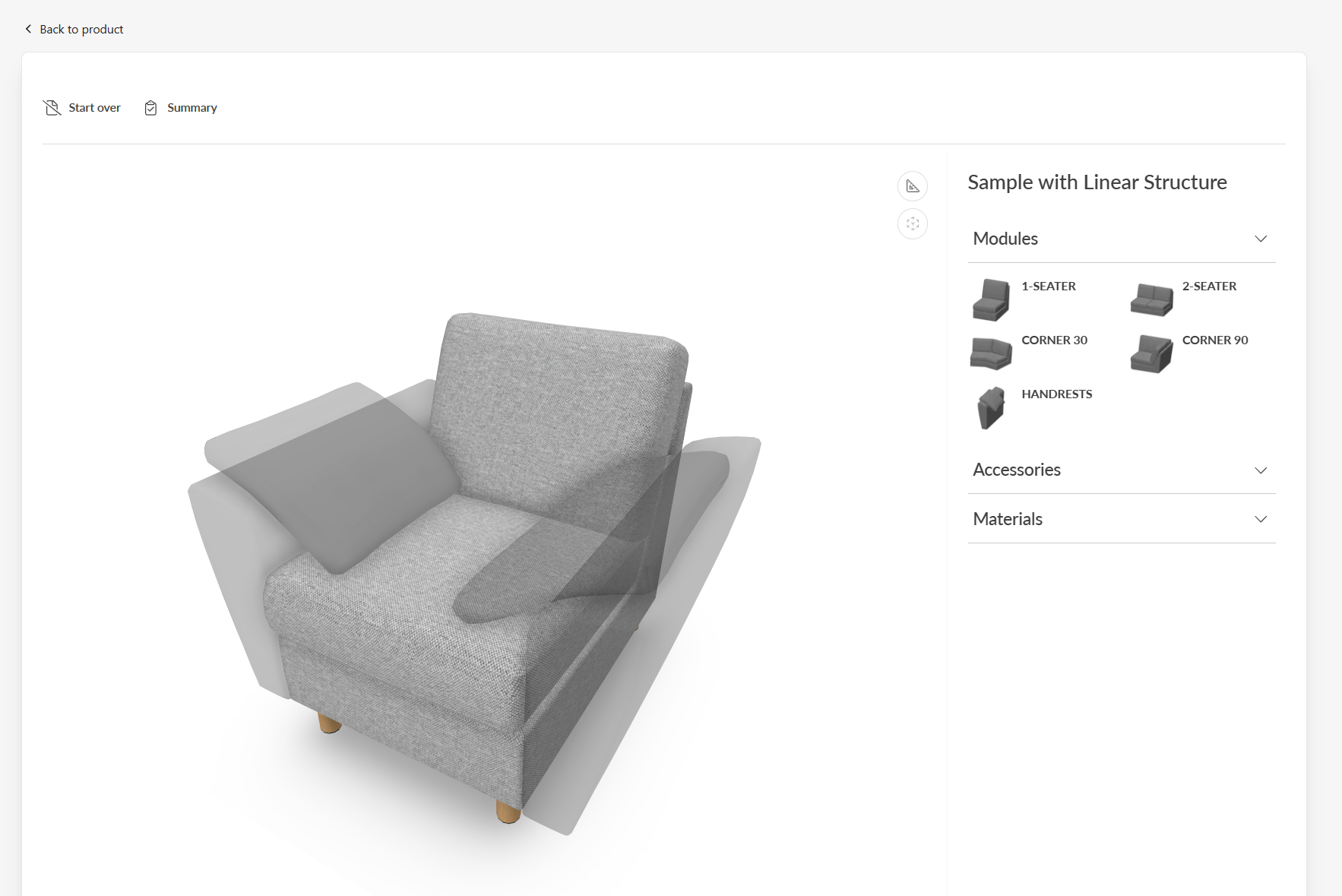
Press back to product
Regenerate "Sample with Linear Structure"
Open 3D view by pressing Play button
- After adding e.g. 1 seater to the plan and pressing handrests, you now see placer for both left and right handrest (arm) being shown in 3D scene and user can click to scene to which handrest they want to be shown.
Action pending for edit button
Category structure main view in Manager has blue blinking dot animation for each category for which the edit button has not been pressed and changes saved. So currently it marks for if there has been any modifications to the default localizations made. So after saving changes to a category (be it the default categories, or newly added category or subcategory) the blinking icon goes away.
CustomProperties
Custom Property set (or sets) allow definition of logic that defines something that otherwise is not predefined in the system logic.
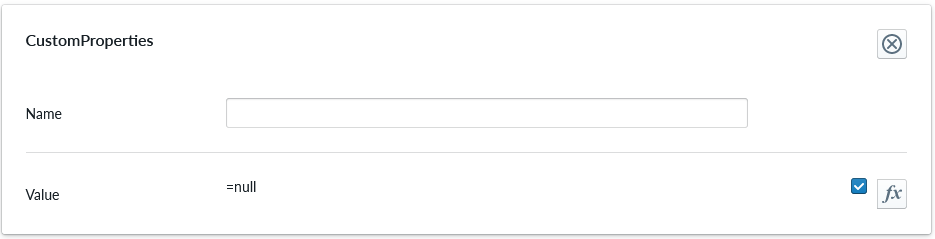
| Property Name | Type | Localized | Description |
|---|---|---|---|
| Name | Text field | N | The name of the custom property. It can be referred to from other scripts |
| Value | Scripting | N | Value or scripting logic that the property has |
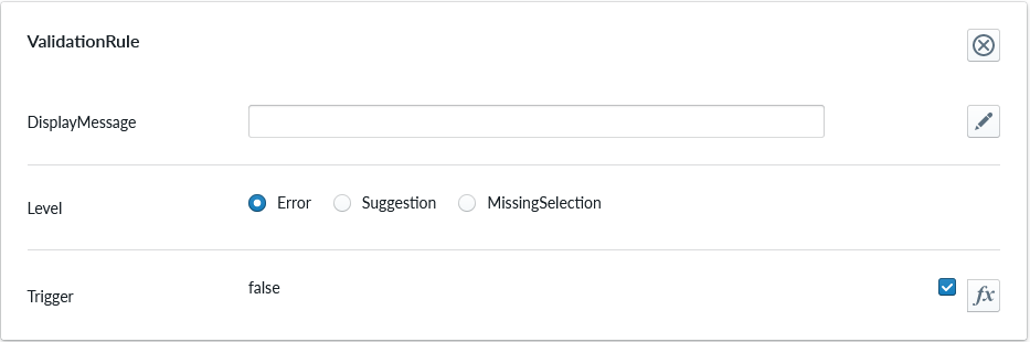
ValidationRule
Validation rule property set is used to define logic that can be useful to ensuring the item where the validation rule is will follow define rules.
| Property Name | Type | Localized | Description |
|---|---|---|---|
| DisplayMessage | Text Field | Y | Text that is shown on the Planner when the conditions of the rule are true |
| Level | Radio Button | N | Selection should the rule show error, suggestion or indicating something is missing |
| Trigger | Scripting | N | The logic that defines the validation rule |
Note
Validation rule level states correspond the next error levels. Error => "Error" Missing Selection => "Warning" Suggestion => "Info"
If the "add to cart" button is available, in case we have an error, the add to cart button will be disabled and not clickable until the error is fixed.
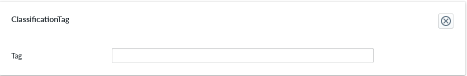
ClassificationTag
Classification tag allows the configurator to assign a custom tag name to a product item. These tags are exposed in the scripting system via the Tags property alongside automatic tags such as role:product and list:*. Use the built-in Contains function to check whether a component or structure has a given tag:
Contains(Tags, 'BottomMAT')
Contains(Root.Bottom.Component.Tags, 'BottomMAT')
| Property Name | Type | Localized | Description |
|---|---|---|---|
| Tag | Text field | N | A label that is associated with the item it's been configured to |
UnitImage
UnitImage is used to enable unit image capture(s) on a composition at the product level or on a selected part which allows to see the thumbnail from a certain angle or even more angles. You can create as many UnitImage property sets as you want, each one will create a capture, for the composition if you add it under a product or for a part. If the property set is not added a default capture will be generated. When this property set is used, the currently selected colors and accessories are included in the image shown in the summary page instead of the fixed image. The camera angle and parameters can be adjusted for the unit image capture.
![PROPERTY_SET: UnitImage]
| Property Name | Type | Localized | Description |
|---|---|---|---|
| CameraAngleX | Number (degrees) | N | Camera altitude angle. A value of 0 captures the image from the front and 90 captures directly above. |
| CameraAngleY | Number (degrees) | N | Camera directional angle. A value of 0 captures the image from the front, 90 from right side, 180 from behind, and 270 from left. |
| CameraFov | Number (degrees) | N | Field of view angle for the camera. Should be in range 5-120. Small angles generally lead to visually better results as the unit images are quite small in size and commonly shown next to each other. |
| VisibleInParentCapture | Radio Button | N | Determines the visibility of this component when capturing an unit image of a parent component. |
| ImageWidth | Number (pixels) | N | Capture image width in pixels. Must be between 128 and 4096. Defaults to 512. |
| ImageHeigth | Number (pixels) | N | Capture image height in pixels. Must be between 128 and 4096. Defaults to 512. |
Note
The Summary page will show the multiple captures for both composition and parts.
The PDF view will show only the composition captures at the header level for saving space in the printed form.